Builder
Designer
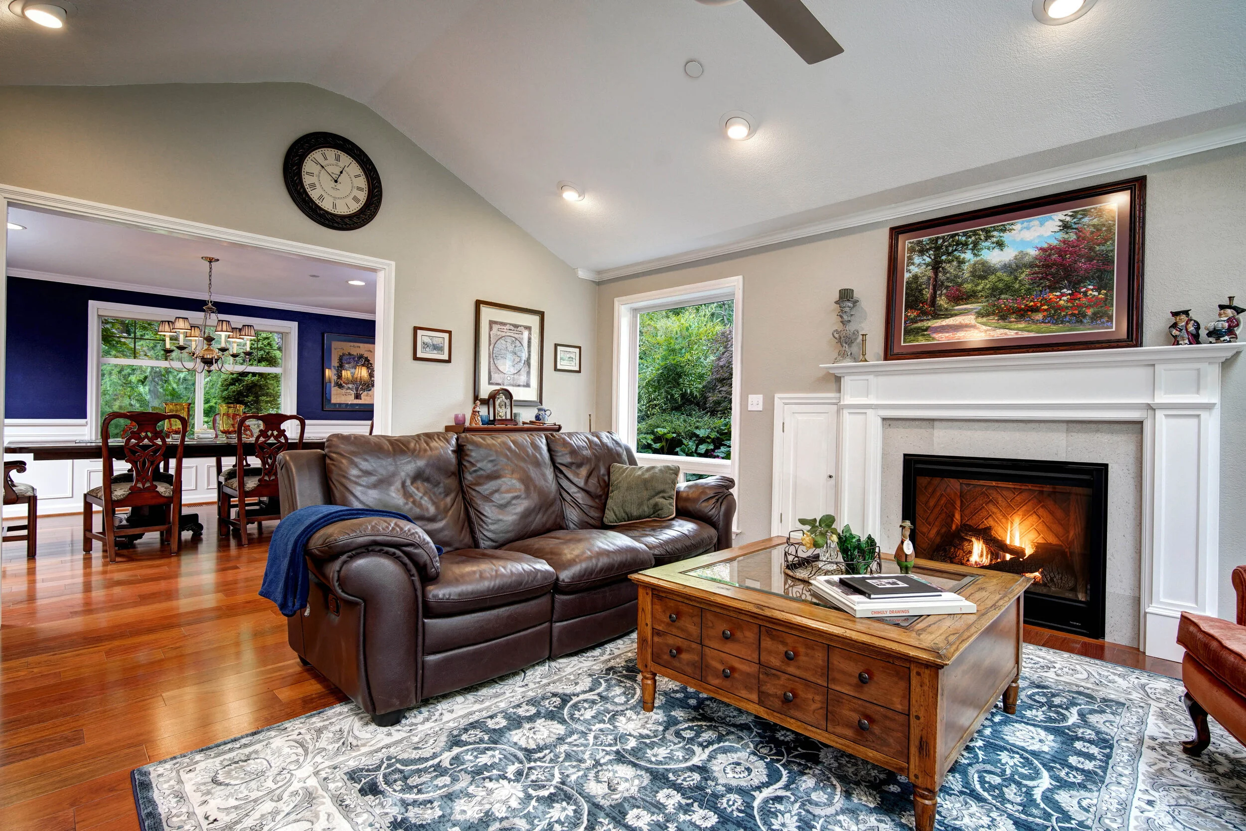
Every inch of this home’s main floor was remodeled including the entry, living room, dining room, kitchen, nook, and great room. Structural load-bearing walls were removed to open up the space and new hardwood floors added throughout.
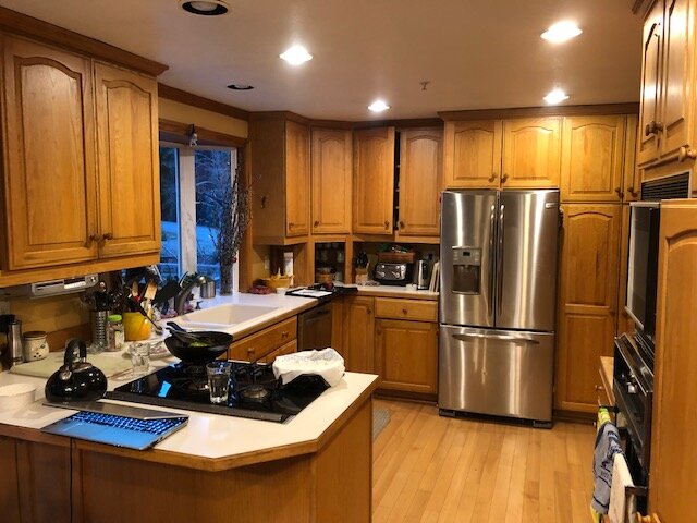
The owners purchased this home as new in 1981. The main floor plan remains the same, but the designer noticed that the layout is dated and saw how much space the home has to offer. The compartmentalized rooms blocked the flow of the natural light throughout the day.
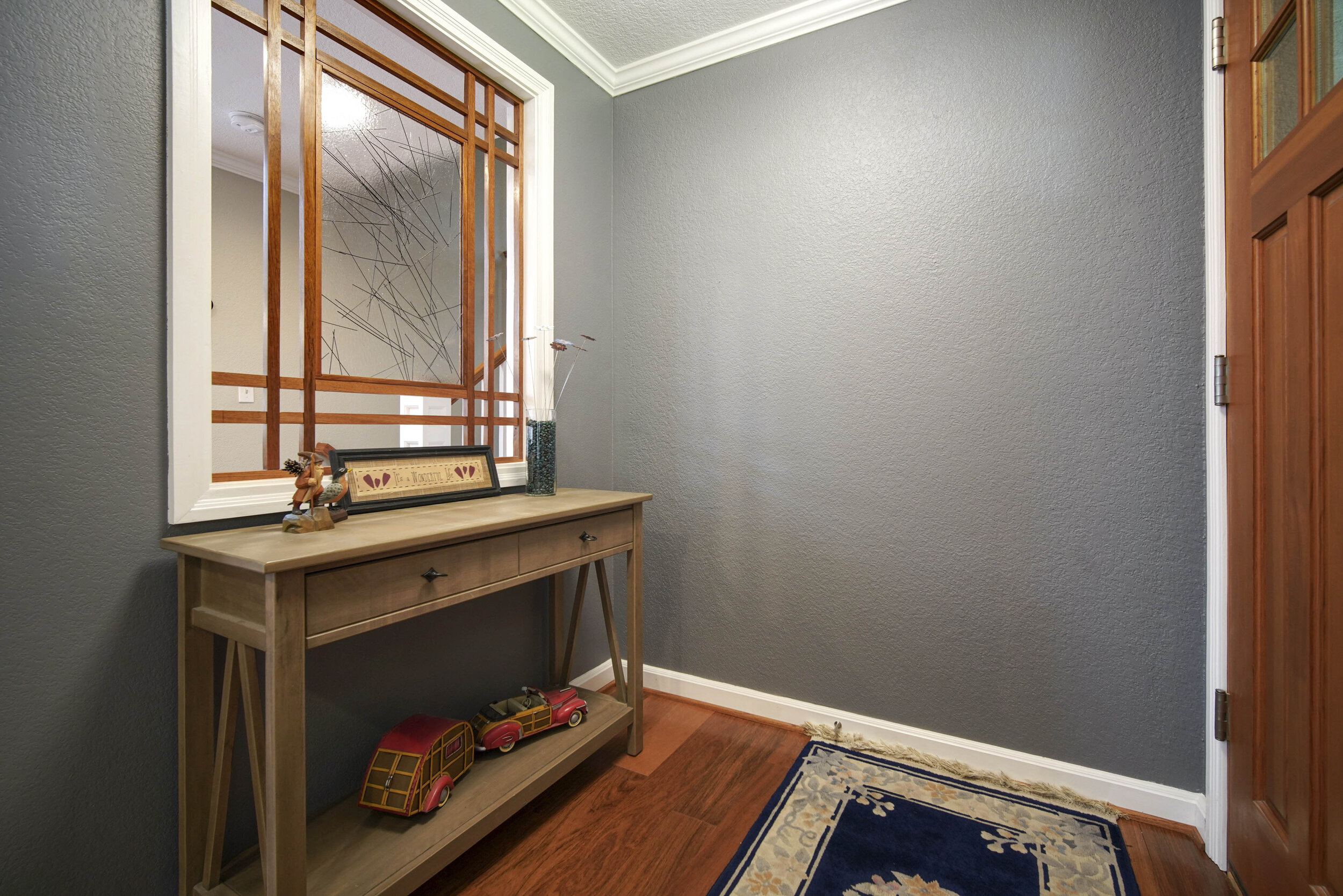
A new entryway was created by building a new wall with a custom glass divider. This helped redirect traffic to new a lounge area, previously the living room.
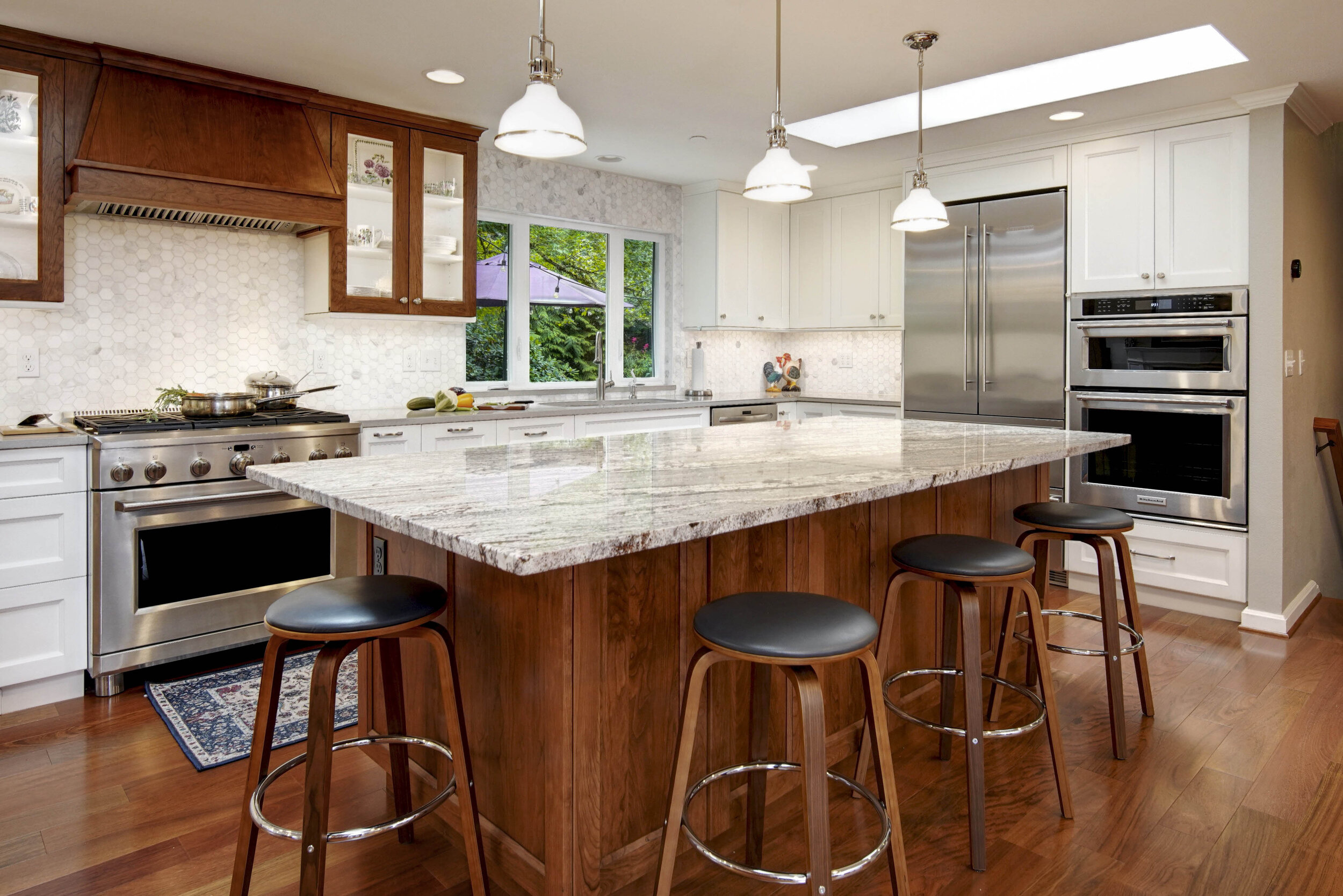
The kitchen was opened up by removing the wall between the living room. The sliding door next to the kitchen was relocated and the space was expanded into the nook area. The large island serves as a table for everyday casual meals. This kitchen contains two tall storage pantries in addition to two different types of spice rack pull-outs and lots of drawers for expanded functional use. The two-tone color coexists with the hardwood floor that the homeowner desired.
The concept of this design is transitional with Craftsman influence.
In the dining room there was a fireplace that separated it from the living room. We eliminated the fireplace to open up the space. The wallpaper was removed and replaced with a deep dark blue paint to recreate the formal old-world charm that blends with the existing furniture.
Coffee area between kitchen and great room.


